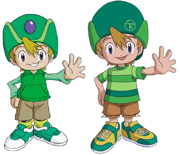
So like I announced last week, Digimon Adventure 2020 is still in Corona time-out. Just like we all should be. Anime shows, they’re just like us. Which is why I have decided to use this period without new content to finally dig into what I’ve been making snide remarks about in every single review so far; the way the characters have been redesigned.
In General
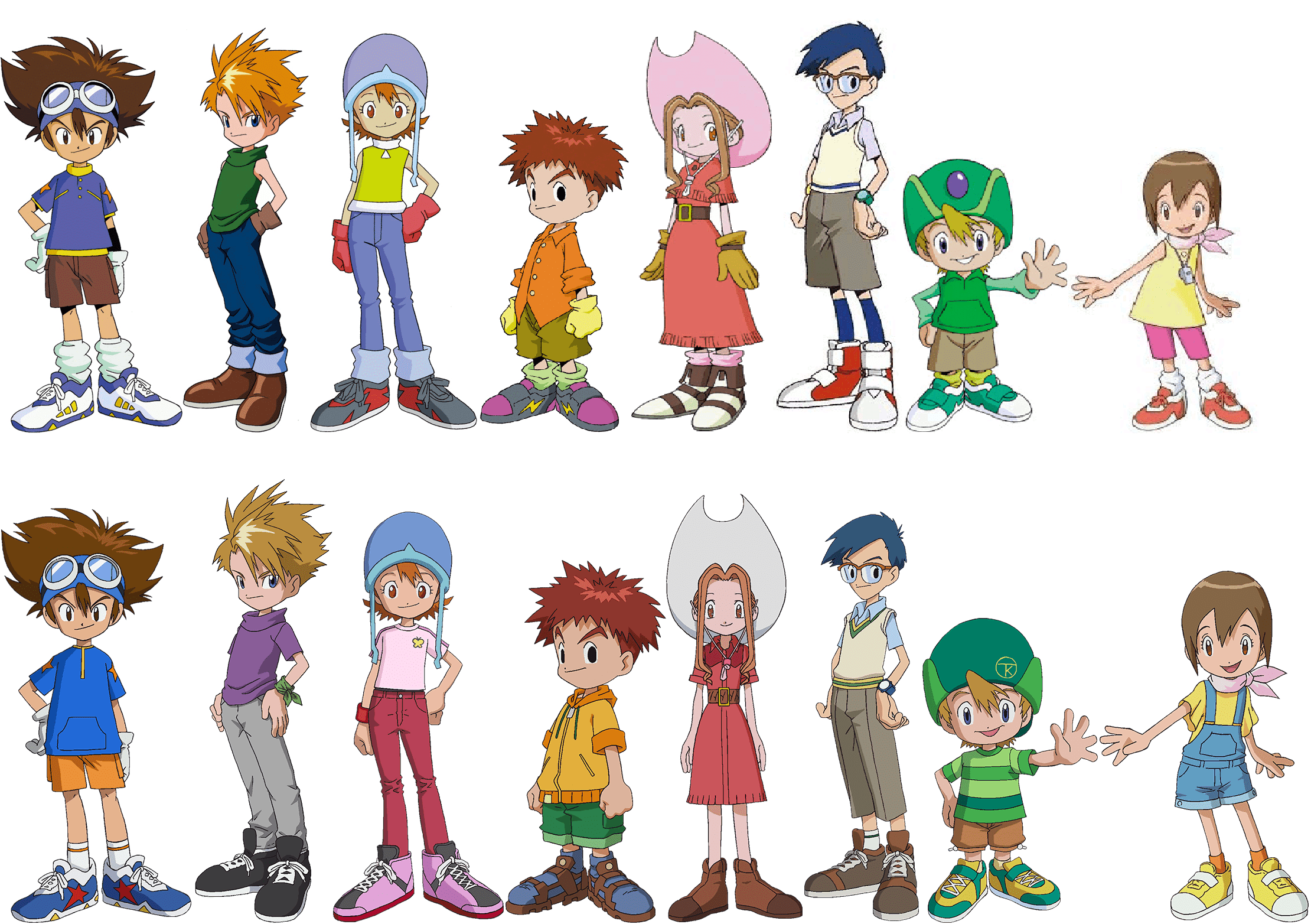
First of all, mad props to the design team for going the extra mile of just replicating all of the poses from the original designs here. And also not going for the more dynamic marketing poses that are still haunting my dreams to this day.
So, that’s great. Also, the characters themselves were largely unchanged; everyone still has the exact same kind of spiky protagonist hair, the girls all still have eyes in varying shades of red on a sliding scale of creepy, and the eyes of Koushiro and Jou are still just black blobs. No reflection, no pupils, just all black blobs. And that’s fine, you guys.
The designs fundamentally all share two things: The socks have been contained, and the gloves were lost. Which is just as well. I do remember my mom telling me that it’s stylish to roll your socks down now or something, but these kids look like they’re all actually wearing knee socks that they shoved down and then stuffed to get that sort of volume. Jou is also wearing actual knee socks. To summer camp.
Same goes for the gloves; was there a trend in late 90ies kids’ fashion when we’d just wear gloves in the summer? So ubiquitous that five out of eight children are just doing it and nobody remarks on it? Did the budget only cover three sets of fingernails? We may never know.
(It is also just highly, highly ironic that kids wearing gloves in the summer is much more in season in our year of the Lord 2020 than it has ever been before.)
It also seems like velcro shoes have gone out of fashion somewhat. Which is accurate. I sure wore nothing but velcro shoes in the 90ies, but that might be due to me having been 6 when the 90ies ended and very, very bad at tying shoelaces.
Anyway. Those are general trends. I will now cover all designs individually in random order because I feel like it.
Taichi
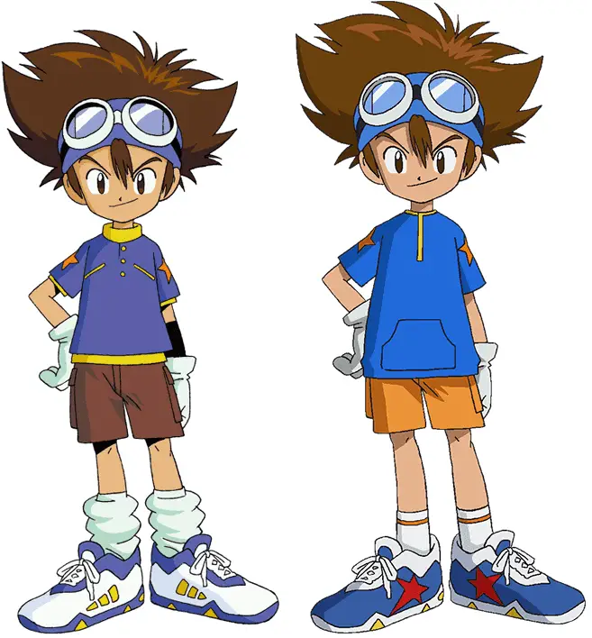
Yes, random order, and he still goes first. He has protagonist-protagonist privileges, okay?
The changes here are rather minimal. Taichi is noticeably the only kid who got to keep the gloves, but he has only used them for punching Digimon so far, so that’s fine, safe, and responsible. What he did lose is the… Sleeve… Wrist guard thing he wore under the glove on his left hand. Yes, that is not a shadow, it is there on purpose, it is there in the show, it’s legit a thing.

Other than that, some details on the top of his shirt were lost, a pocket was added, and the pants are orange now. I don’t understand why, the brown pants were fine and seem like something a kid would wear more readily than bright orange pants, but hey, sure, you hardly notice it. Same with the shoes. Maybe the star design on both shoes and shirt sleeves are a bit weird, but you again hardly notice it. Taichi is fine.
Koushiro
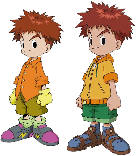
The general color scheme stayed the same, but the pants are a greener green now instead of that muddy color. His shirt is maybe a little more visually interesting on the basis of having a few more details, but I don’t know, a hoodie looks a little warmer than a simple button-down shirt. I feel like the button-down maybe reflected his character a little better, but maybe new Koushiro is trying to look cool.
He also is the only one who is actually wearing sandals. And those socks in sandals are a choice that tells you more about him as a person than the lack of button-down shirt ever could, and we have to respect that.
Jou
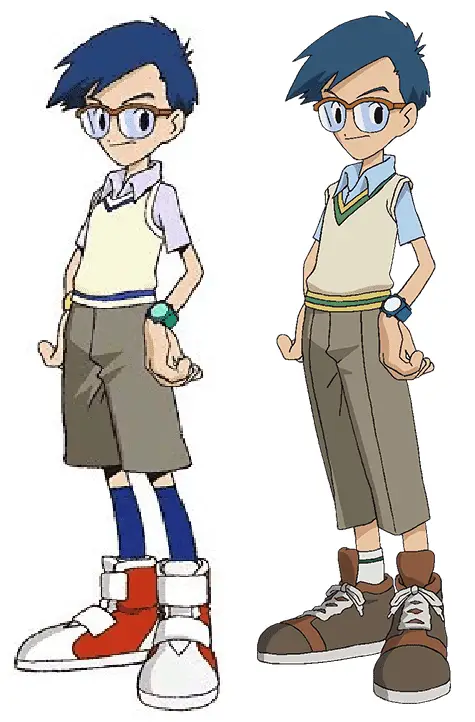
Jou is Jou is Jou. You don’t mess with perfection. Lengthening the pants was a good choice, his shoes look more mature and sensible now, and the wristwatch being blue to match his shirt is a nice change. The collar and seam of his vest could have also been blue to maybe make a more cohesive beige in beige in blue design, but the yellow and green are inoffensive and you hardly notice it. Like. Even less than the minimal changes on Taichi.
Mimi
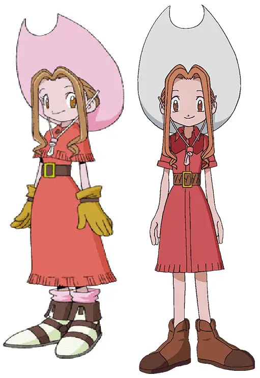
Mimi is still rocking the cowgirl look. Just… with a white hat now. Is it because they took the socks in the same color away? I don’t know. I feel like the hat harmonized very well with the rest of the outfit, but the white one also doesn’t stick out or anything. Like, it doesn’t clash with the new outfit? Which is more than I can say for some of the upcoming designs.
The dress itself is much improved. The shirt part now looks like one of these cowboy shirts, more than the poncho thingy ever could. It’s nice. And I do not mind shortening the skirt a bit. I do mind the shoes. Like. What. Mimi should be the prime candidate for wearing sandals without socks and with painted toenails or something. Or just ballerina flats. Or something recognizably stylish and summer-y at all. What are these things?
Takeru
Now on to the boy with her family’s company logo on his hat. I think. It matches the company logo on Koushiro’s tablet, okay? And also his own first and last name, Takeru Takaishi. No wonder they decided to call him T.K. in the dub.
Yeah so the hat is an improvement, I think. Now it doesn’t look like he has a transformation gem in his forehead that is breaking with the overall color palette. The hat is still kind of weird, but after many, many iterations, I just have to accept that Takeru is a hat guy.
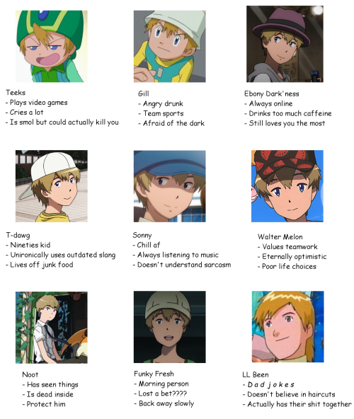
Right here I would like to make a special shout-out to the tumblr user Citrus-Cactus, who, as I have found out while researching this article, is compiling all of Takeru’s hats and that is a valuable resource and also the kind of devotion you really, really have to admire.
However! This is about new Takeru’s design and not just about his hat! He is also wearing a new shirt! An actual t-shirt that seems a lot more appropriate for summertime than a sweatshirt and a vest! I like the different colored stripes, it’s cute. The same goes for the shoes and pants, honestly. There are much more substantial changes here than to, say, Taichi, but they somehow don’t look that different, work for him, and are cute.
Hikari
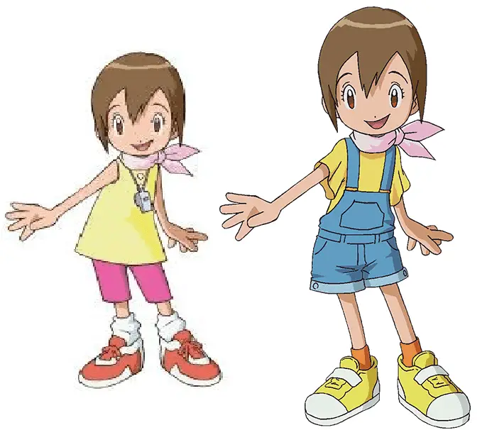
So Hikari got basically a redesign. A completely different outfit. And as someone who in her life has owned exactly one yellow tank top, one pair of pink leggings, and one light pink scarf specifically to dress up like Hikari for Childhood Heroes day at school, I am… kind of okay with this? The sleeves on the new shirt are a bit weird and way too wide, but I like the dungarees, it’s a cute look for her. And they’re an item of clothing that could conceivably be a hand-me-down from Taichi! I like that a lot.
The shoes are a non-issue, but the scarf kind of sticks out, doesn’t it? It’s from her original design, but there it harmonized with the leggings kinda. And if they had to keep something from her original design, I’d rather they’d kept the whistle. You know. The one that used to be plot-relevant a few times. Yes, they have cut the origin story with Greymon and Parrotmon fighting in front of all the original Digidestined, but come on, keeping it as a mythology gag? Ah, well.
Yamato
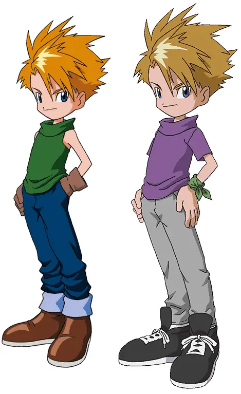
So. That’s different.
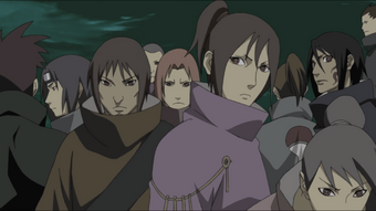
You know, if you’d given me that shirt and told me to fix or improve it, I wouldn’t have necessarily changed its color or given it sleeves, I would have removed the borderline Uchiha collar it has going on.
Not that there’s anything wrong with sleeves or soft shades of purple. I just don’t think of it as any kind of improvement. Also, is he wearing the corpse of his old shirt, faded from the ash, around his wrist now? What is that? A favor from his brother? Is it code for something? Will we ever find out? Who knows!
Don’t ask me why he’s wearing light gray sweatpants rather than jeans. Like. The jeans were fine. They’d still have been fine with the purple shirt. Finer than what’s going on now. Just making the pants a shade darker would have improved the overall look, I think.
I like the shoes, though. The shoes are fine.
Sora
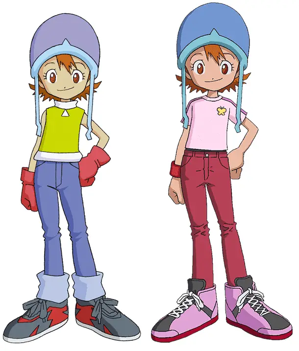
Oh, Sora. Oh, how you have been done dirtier and dirtier by each successively published Digimon Adventure property.
Look, you guys. Sora got the shaft end of development in the original Adventure. The one key point of development she had, and the one solid character trait she had, revolved around playing soccer and being a bit of a tomboy to the chagrin of her more traditionally minded mom. That and being a bit of a team mom were all the things she had going for her in Adventure. Subsequently, she quit soccer and picked up tennis, started dressing more feminine, and eventually ended up fulfilling her mother’s wish to follow her as an ikebana artist. Fancy Japanese flower arranging. It’s a narrative many a tomboy, especially in Japanese media, goes through.
Sooo. Dressing her in different shades of pink from collarbone to toe already rubs me the wrong way for that reason. I also discovered that I actually really, really like her original design. It’s a realistic-looking get-up to wear to a summer camp, it is practical, the color scheme works. The hat is silly, but everything else works.
With the reboot, the hat is still silly, but nothing else works. Okay, maybe the pants. The pants would work in isolation. The shirt and the shoes, though? And then why keep the blue helmet? Why not make it pink as well?
And I don’t even hate pink. It’s not about that. If they decide to tone down the tomboy angle to not make the later developments as, uh, I’m not going to be judgemental and just going to say surprising, this could have been a good visual way to do this, if it hadn’t been for three different and clashing tones of pink in one outfit. While paired with a blue helmet. Or soft hat. I don’t know. It had two modes.
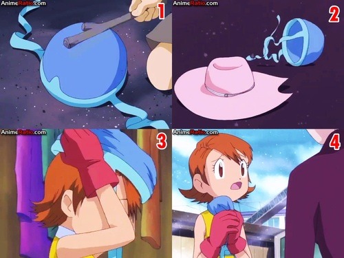
Was this hat more plot-relevant than Hikari’s whistle?
Maybe the clashing shades of pink are a sign of her mom buying her clothes. And Sora puts them on in a mismatched way as an act of rebellion or something. That’s gonna be my headcanon. She seems a bit too cheerful for that so far, but she has also had like one line in three episodes, so who knows! Will we ever know? I don’t know!
Oh, also, I like the little thing she wears on her wrist. The ghost of the gloves that have gone there before. Much like the strip of fabric that Matt has tied to his wrist. Are those connected? I don’t know! But I want them to be! Let’s rile up those shippers. Let’s get hyped. Ship war like it’s 2001 and we haven’t seen the epilogue yet.
And that’s… All I have to say to that, really. Some of these designs, like Mimi’s, Jou’s, Takeru’s and even Hikari’s to an extent, are actual improvements. Some are just minor tweaks that are fine. And some are genuinely weird and puzzling and foreshadowing things I already don’t like, but hey. I’ll try and stay optimistic about it! And so should you! For now!
I’ll go do some more research on Takeru’s hats now. I’ll see you when I see you. Which will be the Wednesday after the next episode comes out, whenever that will be.


